You are using an out of date browser. It may not display this or other websites correctly.
You should upgrade or use an alternative browser.
You should upgrade or use an alternative browser.
Premise jQuery Mobile MiniBrowser UI - Preview
- Thread starter w84no1
- Start date
Motorola Premise
123
Senior Member
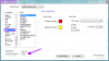
More refinements:
The vertical height of the Interior/Exterior section has been reduced.
The vertical height of the temperature controls has been increased.
The setpoint value has a new section beneath it indicating the current HVAC and Fan status. Typically this area is blank unless the furnace is on ( "Heat" ), the AC is on ( "Cool" ) or the furnace fan is on ( "Fan" ). You could also mimic AutomationBrowser's Thermostat and use icons to represent the status. The horizontal dividing line, delineating the setpoint value and the status, is probably unnecessary if you use icons (maybe not needed at all).
The whitespace between the remaining rows of widgets has been increased.
Attachments
C
chucklyons
Guest
W84...Absolutely awesome!!! Looking forward to whats next, but looking much more forward to seeing some code and 'how to'! ^_^
I kind of like the white frame, but either idea is fine with me. I would be willing to forgo any extra modifications if it meant I could use this a day sooner (and donate a day sooner ") ).
).
I studied jQuery last night, it is very neat. It's definitely the solution we've needed to reduce bandwidth usage. I like the clean look of not having images as buttons, having a slider etc... The Silverlight minibrowser that a few different folks attempted were good, but they would have never been as cross platform as what w84no1 has created.
).I studied jQuery last night, it is very neat. It's definitely the solution we've needed to reduce bandwidth usage. I like the clean look of not having images as buttons, having a slider etc... The Silverlight minibrowser that a few different folks attempted were good, but they would have never been as cross platform as what w84no1 has created.
123
Senior Member
Thanks, Roussel.
My interest lies in ensuring the new MiniBrowser UI has at least the functionality found in the current version if not more so. I know a lot of people get excited by a fresh new look (sizzle sells) but I feel none of this is worthwhile if it doesn't provide adequate information and control.
W84no1,
I spent a whack of time overhauling MiniBrowser to produce a clean foundation for something better, smarter, faster. I'm pleased to hear you leveraged the "UIAdvanced" feature. I put that there for this very reason. I'm really looking forward to testing your work.
If there's one thing I'd like to see in the "UIAdvanced" version of a MediaZone is a faster way to browser through media. The current implementation follows the original technique and, being limited to pure HTML and no JavaScript, is slow and clumsy. What's sorely needed is a datagrid that lets you sort and select by Artist, Album, Track, etc.
etc6849,
I agree it must be cross platform. Given the proliferation of devices that have HTML5-compliant browsers, it is now possible to create attractive and sophisticated applications. For example, I recently ran OpenRemote and iRule designers via my PlayBook's browser. This is the degree of device-neutrality Premise needs.
samgreco
Active Member
What's sorely needed is a datagrid that lets you sort and select by Artist, Album, Track, etc.
Hear, Hear! Both in AB and MB.
I like the idea of improved mp3 sorting too. It would be also be neat if video files could be handled in a similar manner. The closest thing I've seen is the UPnP modules a few users posted. I never could get the UPnP thing to work, but back then I only had one UPnP device to try.
Wouldn't it be awesome to use your phone to find a movie you want to watch through Minibrowser, then tell Premise which DLNA or UPnP device to use to play it?
Wouldn't it be awesome to use your phone to find a movie you want to watch through Minibrowser, then tell Premise which DLNA or UPnP device to use to play it?
123
Senior Member
I see there are several jQuery datagrids available. What I like about this one, SlickGrid, is the absence of static paging. If you have a smartphone or tablet, check out the examples where you can effortlessly swipe through 50000 records. OK, that's not the way to find a track but you have to love the technical prowess of this technique that dynamically loads the records. No "page 1 of 50" message and "Next/previous Page" buttons!
https://github.com/mleibman/SlickGrid/wiki/Examples
https://github.com/mleibman/SlickGrid/wiki/Examples
w84no1
Active Member
More refinements:
The vertical height of the Interior/Exterior section has been reduced.
The vertical height of the temperature controls has been increased.
The setpoint value has a new section beneath it indicating the current HVAC and Fan status. Typically this area is blank unless the furnace is on ( "Heat" ), the AC is on ( "Cool" ) or the furnace fan is on ( "Fan" ). You could also mimic AutomationBrowser's Thermostat and use icons to represent the status. The horizontal dividing line, delineating the setpoint value and the status, is probably unnecessary if you use icons (maybe not needed at all).
The whitespace between the remaining rows of widgets has been increased.
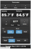
The current HVAC and FAN status is handled by the blue buttons below. What ever is in blue is the current status of the system. I don't think it is necessary to give the status in 2 places?? Am I missing something obvious?
Thanks for being a second pair of eyes, I would have missed a lot of functionality without your help.
123
Senior Member
.. on a smart phone there is not enough horizontal space to fit all the controls.
Try one or more of the following:
- Bye-Bye Fahrenheit
Eliminate the use of "°F" everywhere. I think most people will know what unit of measure they are using. In the USA, an interior temperature of 72 is understood to be comfortable whereas in the rest of the world 22 is comfy. If I see 72 on my thermostat (I live in metric Canada), I know someone has changed it from Metric to Imperial (or something has gone horribly wrong with my furnace 72C = 162F). As an olive branch, you could post a small "(°F)" in a title somewhere or simply leave it be for the setpoint. - Hello Toggle Buttons
The Fan and Mode controls can be toggle buttons. Instead of two buttons each, you'd only use one each. - Ol' Man Combo
The Temperature Mode control effectively has four states. Perhaps an old-fashioned combo-box?
123
Senior Member
Here's how I understand it and you tell me if I missed it.The current HVAC and FAN status is handled by the blue buttons below. What ever is in blue is the current status of the system. I don't think it is necessary to give the status in 2 places?? Am I missing something obvious?
Temperature Mode
This lets the user select the HVAC system's operating mode: HEAT only, COOL only, AUTO switching between heating and cooling, or OFF. HEAT, COOL, and AUTO, represent the desired operating mode and not the current operating status. In other words, they don't represent what the HVAC system is doing at this very moment.
I may have selected HEAT but if my home is not cold, the furnace won't activate so its current status is "inactive". The same holds true if I select COOL and my home is not hot so the status of the HVAC system remains "inactive". The moment the AC unit activates, AutomationBrowser's Thermostat displays a cutesy animated GIF showing falling snow. That's the true current operating status of the HVAC system; it is actively cooling the house. If I select AUTO, the current status could be heating ("HEAT"), cooling ("COOL"), or inactive (empty string). That's why my mockup display's the HVAC system's current operating status beneath the setpoint value.
Imagine using the UI remotely, decrementing the setpoint, and seeing the "COOL" and "FAN" messages appear where there was nothing but blank space. That's the satisfaction of knowing your AC unit respected your command to cool your home.
Fan Mode
I'll grant you that displaying status for this one is partially redundant. It the Fan Mode is set to ON then, well yeah, it's current status is also "on" and a separate indicator is redundant. However, if I set it to AUTO then its current status could be "on" or "off". If the furnace or AC kick in then the Fan's current status is also "on". That's the way it works in AB's Thermostat so I included it for completeness. I didn't use the word "ON" in the mockup because I'm not suggesting to display its opposite mode, "OFF". Just "FAN" is sufficient to understand the Fan is currently operating.
Whew! I was afraid I was becoming a PITA!Thanks for being a second pair of eyes, I would have missed a lot of functionality without your help.
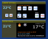
The attached image is what the Thermostat looks like In AutomationBrowser. I cranked up the heat to cause my furnace to activate. As a result, two animated GIFs are displayed: Dancing flames indicating the furnace is operating and whirling fan blades indicating the fan is on.
Attachments
w84no1
Active Member
OK, that is one of the problems with not actually having the device. I was using a fake thermostat so I could get it to display in MB. The only animated gif I ever saw was the fan.
The button states are set by the xml response from mbState
I guess I am going to need some help to get this thing right.
FanControl = 1(On) or 0(Auto)
UserHold = -1 or ?
Mode = ?
TemperatureMode = 0(Auto), 1(Heat), 2(Cool), and 4(Off). Is there a value for 3?
CurrentSetPoint = the current set point
And I don't see an outdoor temp in the xml, is that because I don't have a real thermostat?
I am going to need help with the values so I can get the functionality correct.
The button states are set by the xml response from mbState
Code:
<premise version="1.0">
<Object ID="{E8679EF5-D964-4122-88A4-3144EAB99ADA}" Name="Thermostat" Flags="512l" Class="sys://Schema/Device/HVAC/Thermostat" BoundObject="{63245DB6-6670-41F7-9882-38862BDF8DED}" FanControl="0" UserHold="-1" CurrentSetPoint="301.483333333333 K" TemperatureMode="4" Mode="2" />
</premise>
I guess I am going to need some help to get this thing right.
FanControl = 1(On) or 0(Auto)
UserHold = -1 or ?
Mode = ?
TemperatureMode = 0(Auto), 1(Heat), 2(Cool), and 4(Off). Is there a value for 3?
CurrentSetPoint = the current set point
And I don't see an outdoor temp in the xml, is that because I don't have a real thermostat?
I am going to need help with the values so I can get the functionality correct.
Similar threads
- Replies
- 53
- Views
- 2K