I like post number 7 the best. It draws attention to itself without giving out unnecessary info. I never liked the idea of advertising the monitoring company, nor the alarm system brand. Great for manufacturer or companies, but can lead to someone intent on breaking in, to get necessary info (as stated above). We are eventually going to have a strobe on our house. This kind of clue, along with stickers will make people think twice. We also avoid any easy ways of getting in (glass doors etc).
You are using an out of date browser. It may not display this or other websites correctly.
You should upgrade or use an alternative browser.
You should upgrade or use an alternative browser.
Decals
- Thread starter snakevargas
- Start date
drvnbysound
Senior Member
So, without spending much time on this (literally about 2 minutes), and wanting to guide the proof process a bit before I spend a lot of time cleaning everything up... I took the image from post #7, and the suggested text from post #9, and came up with the attached 'proof'.
Basically, I literally saved the .jpeg provided, converted it into a vectorized file (which is what makes the low quality .jpeg look a bit rough), then I added in the new text.
Anyhow, let's see where this goes...
Basically, I literally saved the .jpeg provided, converted it into a vectorized file (which is what makes the low quality .jpeg look a bit rough), then I added in the new text.
Anyhow, let's see where this goes...
Attachments


SDA - I hear what you're saying and agree with you but there is no way I'm putting that up in my window, whereas I would potentially put the previous one drvnbysound put together. Hopefully, we (community we) can combine the two and come up with something that looks nice, simple, and effective.
Thanks both of you for throwing out the proofs. Keep them coming.
Thanks both of you for throwing out the proofs. Keep them coming.
drvnbysound
Senior Member
Do 'we' want the sticker to be bilingual? That will certainly effect the design and how it would need to be arranged.
If 'we' are wanting to stick with something somewhat small... a bilingual design will need to be limited in what it says, strictly due to limited space; a bilingual design would generally stay pretty symmetrical, thus cutting your space in half. By removing the need for an additional language, it frees up a lot more space for text and allows more flexibility in terms of design elements.
If 'we' are wanting to stick with something somewhat small... a bilingual design will need to be limited in what it says, strictly due to limited space; a bilingual design would generally stay pretty symmetrical, thus cutting your space in half. By removing the need for an additional language, it frees up a lot more space for text and allows more flexibility in terms of design elements.
snakevargas
Active Member
As newalarm points out, bilingual may not be necessary. "Warning" and "alarm" are probably understood by most foreign language speakers. Alarm in particular is quite similar to alarma.
I would suggest taking drvnbysounds design and change the 3 line midsection to:
Alarm system
Monitored 24 hours
Bigger print for "alarm system". Slightly smaller font for "monitored 24 hours"
"Notifications" is a pretty big word, and implied by "monitored".
I would suggest taking drvnbysounds design and change the 3 line midsection to:
Alarm system
Monitored 24 hours
Bigger print for "alarm system". Slightly smaller font for "monitored 24 hours"
"Notifications" is a pretty big word, and implied by "monitored".
drvnbysound
Senior Member
Soo... let's try Proof #2
Note: It's very easy for me to change the box dimensions and such (so that there isn't so much dead space around the lettering). But rather than waste the time on this now... I'm trying to keep it loose and just provide proofs for discussion.
Note: It's very easy for me to change the box dimensions and such (so that there isn't so much dead space around the lettering). But rather than waste the time on this now... I'm trying to keep it loose and just provide proofs for discussion.
Attachments

I like it but I wonder if something this generic will actually be a deterrent.
I know some mention not wanting an ADT sign in the yard because of the extra information it gives but frankly, I dont live in a mansion. I'm tryin to stop the idiot from breaking into my house, not the professional that might be able to break in because it's an ADT vs another alarm.
So my question is, would something this generic work for the idiot burglar or would a known brand deter better? Brand recognition does evoke other feelings/imagery in people so that's why I ask.
Attention May be better then Warning that to a spanish speaker may mean nothing.
Spanish: atención
Portuguese: atenção
Word "Police" is also a universal word that is used in most romance languages. Though there could be a legal impediment to using the word.
ATTENTION (ALL CAPS)
ALARM SYSTEM (ALL CAPS)
Police will respond
To deviate a bit, the Stop sign and words 'stop' is universal. Maybe not as bold as is shown in SDA's post #19, but could be done with a red border and white interior. You want to draw attention without being too ugly from too far away.
STOP (ALL CAPS)
ALARM SYSTEM (ALL CAPS)
Monitored 24hrs
But I do Like drvnbysound's sign in Post #23
Could I suggest maybe doing two mockups and doing a poll to see what users like best?
I currently snagged some lawn signs from another company and stuck them front and rear, and have one small sign sign in a door from homesecuritystore.com. i think it is about 2 to 2.5 inches wide and seems to be a perfect size. What do others do? Small stickers on each window?
In my opinion, to respond to dgage above, the addition of each deterrent is what makes thieves stay away. Signs, locked gates, motion lights, a doberman will make people think twice, or go to the next house.
In my opinion, to respond to dgage above, the addition of each deterrent is what makes thieves stay away. Signs, locked gates, motion lights, a doberman will make people think twice, or go to the next house.
http://www.signsofsecurity.com/lp/sos_lp.htm?_vsrefdom=paidsearch&?SrcTag=Google&s_kwcid=TC|7684|alarm%20signs||S||4089127560&gclid=CNuVm56zs7YCFUfc4Aodb3AAIw
Found this company that custom makes signs and stickers.
Found this company that custom makes signs and stickers.
drvnbysound
Senior Member

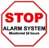
Wow, that was fast. When you step away from the monitor (view from a distance), the Stop sign is superior and more easily recognizable, AND you can read it from far. Of course you can't read the rest, but at least it draws attention to itself.
Design wise, I like the Attention sign better. But you can't read anything from far. (warning sign you did earlier seemed similar).
Both get your attention.
Interested to see what others think....
Design wise, I like the Attention sign better. But you can't read anything from far. (warning sign you did earlier seemed similar).
Both get your attention.
Interested to see what others think....
drvnbysound
Senior Member
Yeah, I don't know that I'll even use these myself, but I figured I could at least help with the design if nothing else. I do quite a bit of vinyl work, and something like this is very simple and easy to do. I'll have to do a blog entry showing some of the things that I've done.
Having said that, I personally wouldn't care all that much if someone could really read it from a distance. I don't think I would care if someone approached my house, to end up reading it on the window they were able to break into and have them question the security of the home, and end up moving along. To me, the important thing would be that it's easily recognizable and understood at the door/windows where it's placed.
Personally, I've taken a different approach. While I certainly wouldn't want anyone to break into my home and have to deal with any damages. I don't necessarily want to advertise that I have an alarm system at all. That could result in having utilities cut and a quicker snatch and grab if said intruder has any expectations. I prefer the unsuspecting approach, where if someone were to open the door they hear the alarm sounding and have just realized they messed up and better take a run for it, because they have no idea what's coming next ;-) But then again, as I said in an earlier post... I'm not all that worried about someone breaking in with multiple police vehicles on my street.
Similar threads
- Replies
- 9
- Views
- 2K
- Replies
- 0
- Views
- 517
- Replies
- 0
- Views
- 797