New CocoonTech.com feature

electron

Administrator
Staff member
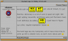
As you might have noticed, some words are now automatically linked. The goal is to link most of the 'lingo' and hardware model numbers back to a site which will contain more information. This should help make the community more newbie friendly as all these acronyms can be rather overwhelming.

Since I wrote this from scratch, the only way I can test this is by implementing it here, so if you run into any problems (such as links are broken), please let me know.

The software does NOT modify your post, it just modifies the data visible in your browser, so if you want to edit your post, you wouldn't notice any changes.
 
Awesome feature Electron. This will help not only newbies but those of us who have been around for a while and are just slow learners too. :lol:

Edit:

I just noticed that HomeSeer is linked but HS is not. For the newbs you may want to try and link the short forms of the works also. Perhaps only underline the short forms and not put them in bold.
 
Hmm.. Just from viewing a few more post I think that i am already annoyed by the boldness of the font. Can you cut out the bold font and just have it underlined and maybe Italic also. The bold is just too big.
 
words such as HA , HT , etc. are all linked, it's just that the dictionary is a lot of work (I spent all night last night adding keywords, and those were just the basic ones). I will definitely be adding HS , I just have to figure out a few regular expression issues :lol:

The bold tags are only temporary until I have more time to come up with a cleaner look, so don't worry about part :)
 
That is really nice (and USEFUL!!)

A couple of SUGGESTIONS:
  • Could an abbreviated definition replace the question in the "mouseover" box? When a newbie/old-timer comes across an unfamiliar term, especially an acronym, a quick "what the heck is this?" may suffice to either jog his memory or clarify the current discussion. If more detail is needed, then the LINK can be followed to the more complete definition / explanation.
    .
  • Could the newly-underlined terms be set to a (currently underutilized) color, such as purple to indicate to a new user / newbie that "this is not a normal LINK - this is a DEFINTION LINK; Pssst, Come Over Here for more information"?
Update: As I read more posts (and see more "special" words), I think maybe the underlining is distracting (as the bold was to someone earlier) and just the different color would be sufficient.

Some messages now look full of LINKs...
 
I am working on the new stylesheet as I am typing this, I am trying a few things, so expect the 'look' to change several times today :lol: The underlining definitely has to go away (by default it is, I didn't hardcode this), and somehow I have to be able to have it stand out without getting annoying.

I already made it so it won't link more than 1 of the same keywords in the same post. As for a short description, that's what is in the new dictionary file already, I just haven't had the time yet to make some of the other required changes, but hopefully it will be done by tonight.
 
I don't think the red (?) text - the current highlighting variation - stands out enough. Not nearly as much as my example above.
 
I tried many different methods, but they are either too 'weak' or too 'strong'. I even tried using a little symbol, i.e. WAF
lastpost.gif
. I'll keep playing until I get it right, feel free to post style examples (I wasn't sure if you were kidding or not lol). I really like the bullet style, but I think it's too distracting. Here are some bullets which might look nice:

misc.jpg
 
electron said:
(I wasn't sure if you were kidding or not lol)
I was kidding with the big yellow sign, though not about the red text.

I originally planned to make the text of the sign say "Click this to read definition or go to appropriate link" or something like that but I didn't make it big enough. ;)

I like the idea of a bullet subscript or superscipt if you can find one that looks good. Maybe the white ">" in the blue circle?
 
electron said:
I tried many different methods, but they are either too 'weak' or too 'strong'. I even tried using a little symbol, i.e. WAF
lastpost.gif
.
Agree! I like the color method (no surprise!) best so far. Regarding the "mouseover" box, another Suggestion/Opinion - abbreviate more (box equals text in quotes:
  • HA "Home Automation - CLICK for more info"
  • HT "Home Theater - CLICK for more info"
  • HS "HomeSeer - a popular Windows-based Home Automation software package - CLICK for more info"
NICE! FAST!!
 
BUG???
ClearToLand said:
'Dumb' Controllers
Referring to the "Reserved Word" PowerLinc in the 3 LINKs in the above QUOTE, only the first instance is "updated" - that's correct; but the 1132B is "orphaned".

What would happen if PowerLinc were the FIRST WORD in the LINK? Would the ORIGINAL LINK be lost?
 
Back
Top