Now Playing 2007 Girder5 Alpha Testing

Aaron

Active Member
John,
I'm using Homeseer 1.7 now but I'm going to be switching to G5 & NR2 soon... once I buy a new PC to run it all.
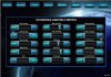
What do you think about making pages that have an all-in-one look for the most used? I like having a graphical view ("eq" look) for dimable lights -- like this ASP page running on my HS1.7 currently:

HACTv2.gif
 
Well Aaron I have always kept my light control panel on one popup. I will most likely do something along the same lines.

John

here is what I am using now....
 

Attachments

  • lightcontrol.jpg
    lightcontrol.jpg
    77.9 KB · Views: 15
John,
The interface looks nice... I have a few questions/suggestions:

The interface seems like a lot of wasted space in the list display area? This will hurt people with smaller screens and you will not be able to display as much, thus not as functional I'd think?

I suggest changing the interface and buttons into something more streamlined. Maybe grouping the controls at the bottom or all on one side.
I personally always liked interfaces with multi-function buttons like this...
mediacenter.gif
-- Could place this in the left bottom corner or the bottom center, etc.
 
IMO, if he has no need for more space, then it isn't really wasted. I like the design, it's clean (I hate clutter) and seems to be efficient.
 
Not sure what other information is needed. It sounds like you want to get your feet wet so jump in the water is fine. I am now running NR and G5 totally. No more Homeseer. Time to get out that credit card and buy NR, NRD and G5. Then you can build your personalized skin. Its alot of fun!!!


John
 
I've built skins for many interfaces and I understand how time consuming and labor of love it is. I was just thinking if you wanted to share it with others that may be using it on a smaller screen it may be difficult to read the lists in the center... thus my suggestion to make it larger to fill more space and the possible follow-on requirement of moving the buttons.

Up to you if you want to do it, I just think more people will be able to use it that way. I always build not only for myself but for others too. You can see my old NR interface is here... http://members.cox.net/ltek/netremote.htm I made it to be simple, easy to navigate, and to be able to access most functions/features on the screen at all times or with only 1 step to get there.

Whatever you decide if fine, just thought I'd mention it.

I need to get around to buying a new PC to support everything... my HS1.7 is running on a PII-500!
 
John,
The interface looks nice... I have a few questions/suggestions:

The interface seems like a lot of wasted space in the list display area? This will hurt people with smaller screens and you will not be able to display as much, thus not as functional I'd think?

I suggest changing the interface and buttons into something more streamlined. Maybe grouping the controls at the bottom or all on one side.
I personally always liked interfaces with multi-function buttons like this...
mediacenter.gif
-- Could place this in the left bottom corner or the bottom center, etc.

Actually the transport controls on my screen are designed to be used with your finger on a Fujitsu 3400 800X600 touch screen. I doubt you could use the transport icon you suggested with your finger as it would be pretty small.

John
 
Back
Top